How to Design a Successful Touchcard Postcard
At Touchcard , we’ve spent a lot of time reviewing postcard designs and conversion data to better understand how we can help clients create campaigns that consistently generate positive ROI.
One thing we’ve found is that the quality of your design can make or break the success of your campaign (seems obvious, we know).
As it turns out, there are a few key elements that are almost always present with high-converting designs.
So we’ve taken what we’ve learned and put it into this short guide to help you create postcards that delight your customers and get them to take the action you want.
We’ve also created some free templates and instructional videos to walk you through the design process outlined in this guide.
Templates:
Adobe Photoshop (Download)
For a free Canva template email us at support@touchcard.co.
We hope you enjoy the guide, and happy designing!
Video Guides:
ℹ Be sure to download the free templates above before you start watching the videos.
Photoshop |
Canva |
|---|---|
Headline:
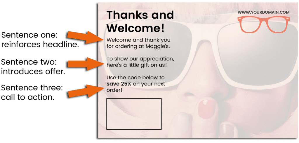
Resist any urges you have to use long, drawn-out or clever headlines. While a clever headline might get a laugh, our data suggests that postcards with clear and concise headlines work best.
If you’re sending postcards to your new customers, stick with something simple like “Welcome” or “Thank You.”
Here’s an example of a postcard with a short headline that gets straight to the point.

Copy:
When it comes to the copy on your postcard, the same rule applies. Keep it simple. Lead with a headline followed by no more than three short sentences that convey a clear message and desired action.
Err on the side of short sentences, large easy-to-read fonts and adequate spacing. For best results, adhere to the guidelines in the image below.
Offer:
If you’re looking for direct ROI, then a discount is probably your best bet for an offer. However, we have a handful of clients who use Touchcard successfully with other types of offers.
Regardless of what you’re offering, there are two important things to remember.
✅ Stick with ONE clear offer/call to action to avoid confusing customers.
✅ Offer something your customers value to increase the likelihood that they will take action.
When it comes to discounts, our data suggests that offering something in the range of 15-25% converts significantly higher than discounts below that window.
If you’re offering a discount and your margins allow, we recommend offering at least 15%.
Call to Action:
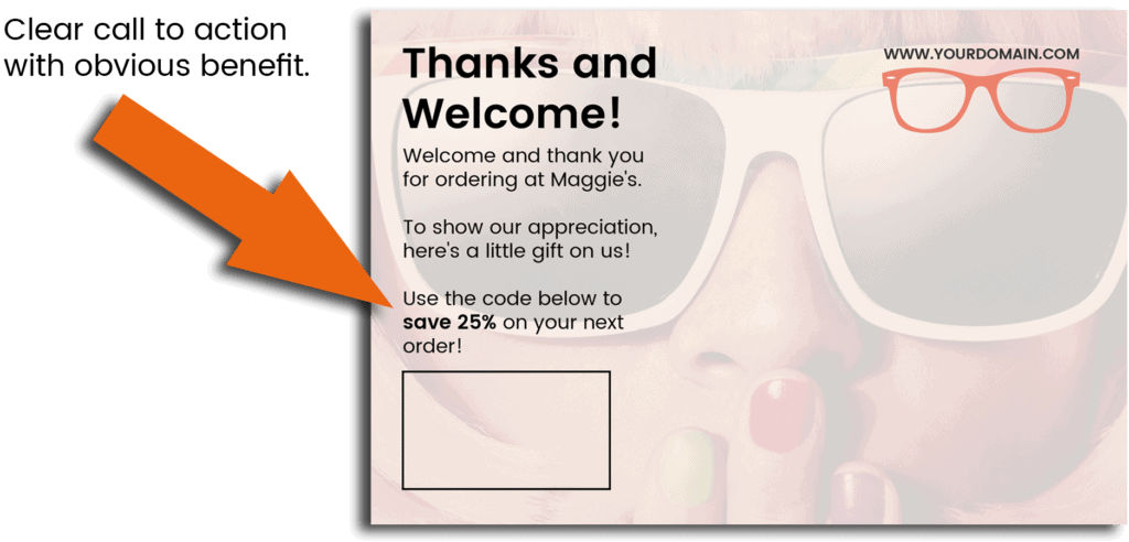
A strong, clear call to action makes it easy for your customers act on your offer and does a lot to maximize conversions.
As mentioned earlier, we suggest including a clear call to action in the copy on the reverse side of your postcard. For best results, ensure that your call to action adheres to these best practices.
✅ Provides clear instructions about what your customer should do.
✅ Clearly features the benefit of taking action.
✅ Appears prominently featured on the card.
See below for an example of an effective call to action.
Expiration Date:
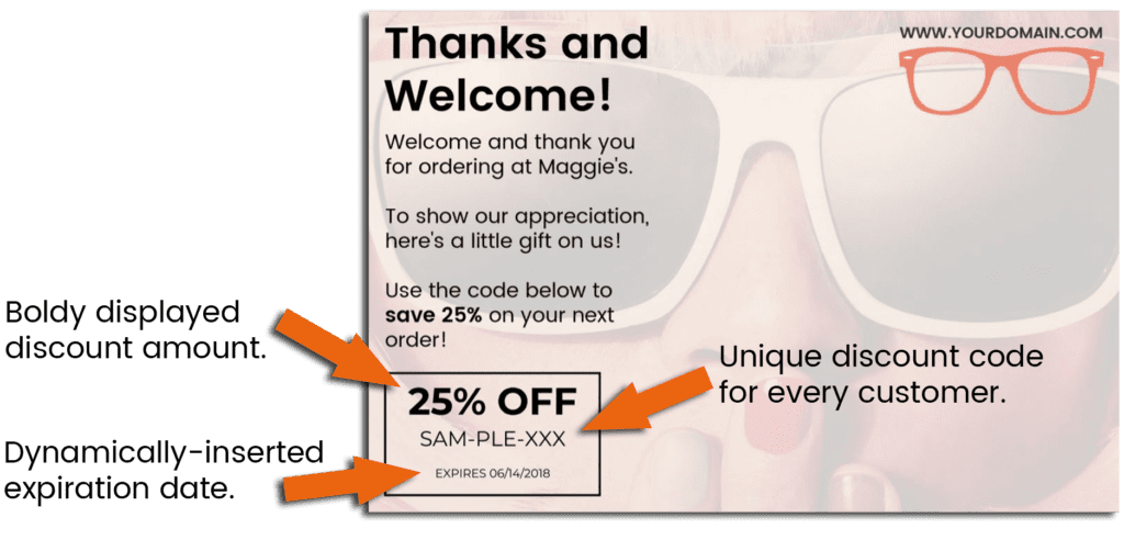
One of the most important things you can include in your design is a clear expiration date. This will help you measure results while encouraging fast action so that you get the best conversion rate possible.
We’ve seen the addition of an expiration date bump conversions by more than 100%. That’s double what you might get without an expiration date!
For this reason, we recommend using our dynamic discount feature to automatically insert a unique, dynamic expiry date onto every postcard you send.
Clients who use this feature tend to see much higher conversion rates than those who don’t.
Here’s an example of a postcard using our dynamic discount and expiration feature.
To learn more about dynamic discount codes and how to use them, check out our short guide on setting up a successful Touchcard campaign.
Evergreen Expiration Dates:
In the rare case that you can’t use the dynamic discount feature, we strongly recommend that you include some kind of deadline to increase urgency and maximize conversions.
One effective option is to use an evergreen expiration window as shown in the example below.
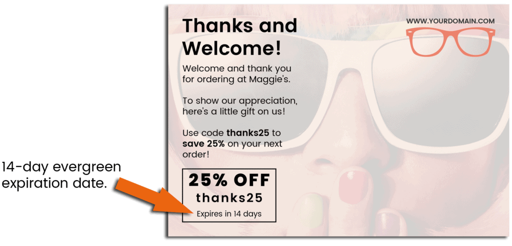
While evergreen expiration dates don’t actually expire, they still add an element of urgency that encourages fast action and higher conversions.
ℹ Watch the videos below to see how you can easily add an evergreen expiration window to your postcard design.
Photoshop |
Canva |
|---|---|
Imagery:
Front:
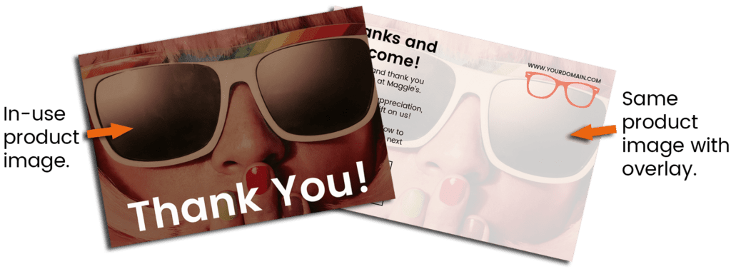
When it comes to the imagery on the front of your card, the number one rule is relevance. If possible, you want your customers to know who sent the postcard without having to read the back.
For this reason, we suggest in-use product images.
If you don’t have a product image or your product doesn’t lend itself to being on the front of your postcard, consider something generic but relevant. Check out these examples.
Reverse:
If you have a good image for the front of your card, then you don’t have to look too hard to find something for the back.
We suggest using the same image, but with a light overlay to ensure contrast between your background and any text.
If you don’t have a product image or just want to keep things simple, consider a dark font on a light background for maximum readability.
ℹ See the short videos below to quickly create an overlay in Photoshop and Canva.
Photoshop |
Canva |
|---|---|
Logo:
While not mandatory, adding your logo is a nice touch that can help boost brand recognition. Typically, we suggest a tasteful placement in the top right-hand corner on the reverse side.
![]()